

Wavelength — BrainStation UX Capstone
A mobile app for people who plan trips around live music. Wavelength helps users discover concerts at a destination, build a trip itinerary around them, and coordinate the logistics in one place. I led the project end-to-end, covering research, UX, brand identity, and a high-fidelity prototype.
01
Ask
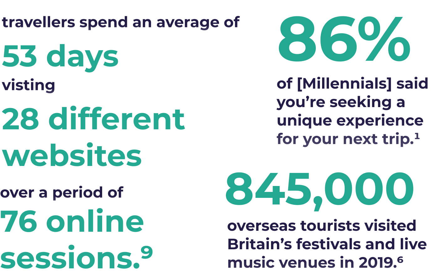
Music travel is a growing category, with roughly 40% of millennials expressing interest in attending music festivals abroad and a third saying music is a primary factor in how they choose a destination. The problem is that planning a trip around a concert is genuinely fragmented, since the concert, accommodation, transport, and coordination with other people travelling with you are all managed separately across different platforms and there is no product that treats the show as the anchor for everything else. Wavelength was designed to be that.
The Live Entertainment and Music industries were hit hard by the global COVID-19 pandemic. However, with the industries seeing exponential growth pre-pandemic, we definitely can expect to see similar results coming out on the other side. The LiveNation CEO Michael Rapino said recently in the company’s quarterly earnings report:
“Looking forward to 2022 and that 2023, all our leading indicators continue to point to a roaring era for concerts and other live events.”
Combined with the itch for travel that many young people have, there is ample opportunity to find new ways to for music travellers engage with live music experiences again, see new and familiar artists, and visit inspiring destinations.
02
Listen
Now that I have collected and parsed through a lot of background Secondary Research, the next phase in the UX Design process is to conduct Primary Research for our user base. This takes the form of user interviews of those who fit in the Millennial music traveller category. These interviews will allow me to gain greater insight into the pain points, goals, motivations, and behaviours of these users, and begin to craft a persona and experience map that represent their user journey.
The UX Design process continues into the Primary Research phase of conducting in-person / virtual user interviews. Crafting the interview guide and engaging with the interviewees is one of the best ways to get first hand data and insights about the problem space, and what our target user and their journey will begin to look like.
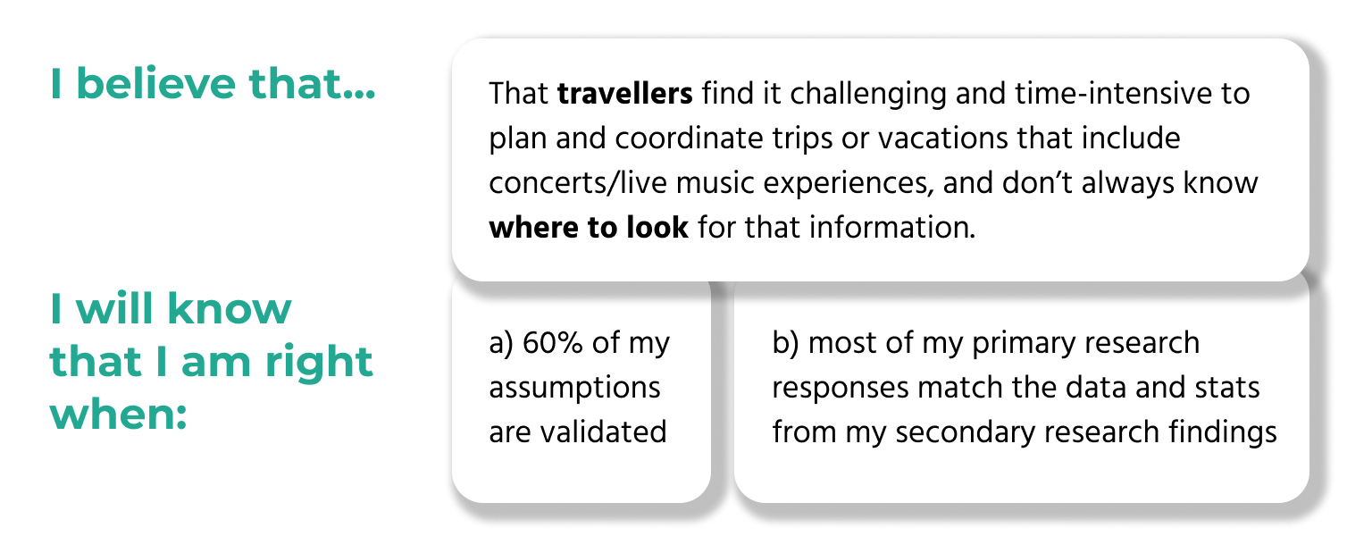
I want to learn how closely my secondary research findings correspond with actual experiences and feelings of interviewees. My goals of this Primary Research phase are to:
- Validate my Assumptions
- See if any of the Constraints are reflected in primary research
- Identify goals, pain points, motivations, behaviours, and insights
Identifying related themes from my user interviews, and pulling insights from those themes, will allow me to begin constructing my User Persona, and mapping the Persona’s experience with the problem space.
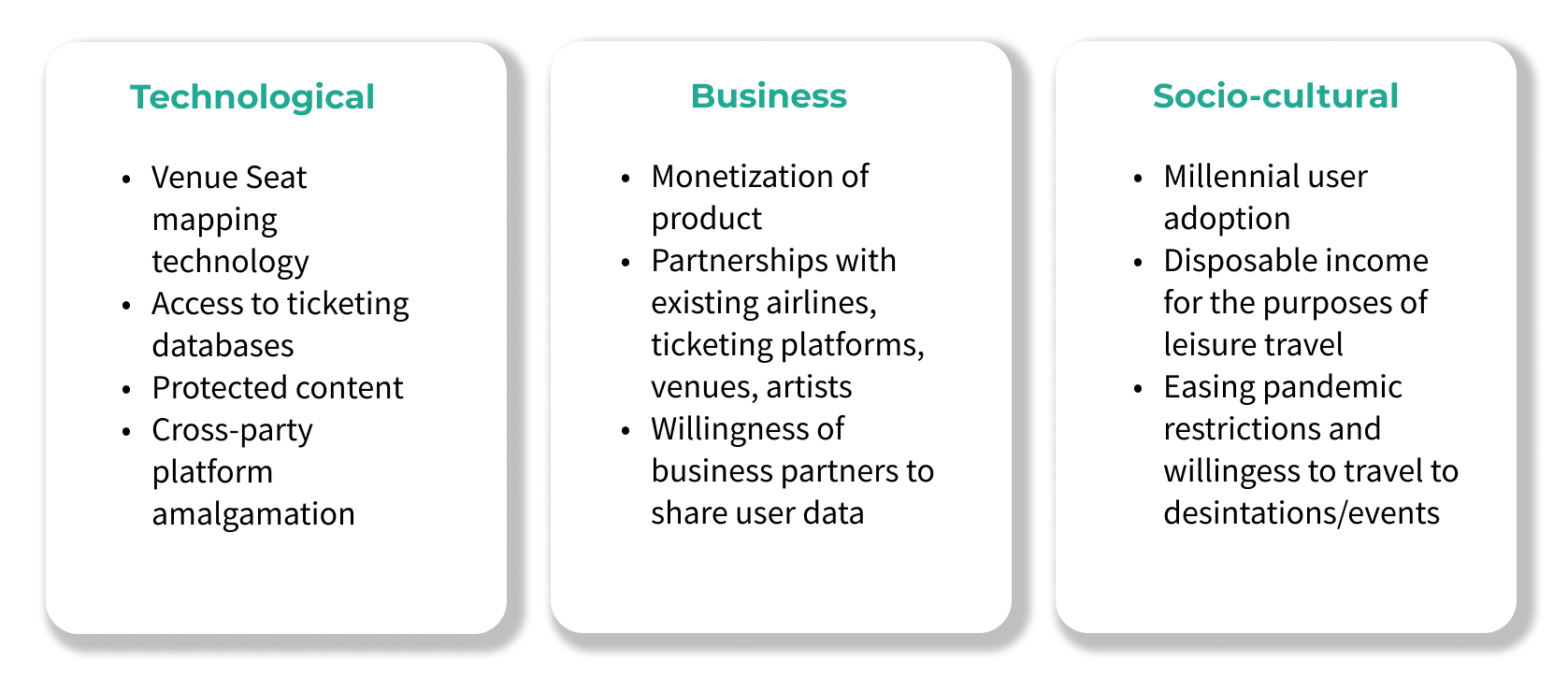
For my primary research into this problem space, and to begin to build my user persona and find more insights into the pain points of music travel, I conducted Phone Interviews with Millennials aged 20-35.
These types of interviews are:
- De-contextualized (not using a product)
- Attitudinal
- Qualitative (Direct)
- Millennial age group (20-35 years old)
- Experience travelling in international destinations
- Experience with live music events
- Fan of listening to and experiencing music in general
- Male or Female
- Residence in Canada/US/UK

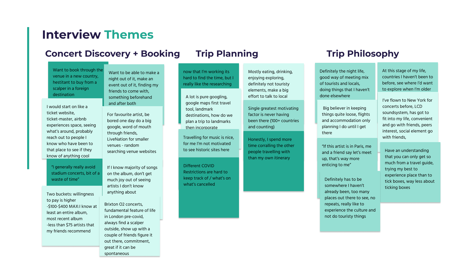
1) Having a digital product that is familiar with a user’s listening habit and is able to suggest related artists’ concerts is a great feature.
2) Booking directly with venue for legitimacy, especially in foreign destinations where you don’t want to risk the secondary market / scalpers.
1) Interviewees indicated that they spent a lot of time both researching their destinations, and communicating and coordinating with their travel partners, but not nearly as much as the Neilsen research data suggests.
2) Music is a top motivator for destination or activity selection while trip planning.
1) Interviewees generally preferred looser itineraries, where they would book the book-ends of the trip, but allow for some spontaneity once on the ground at their destination.
2) Travelling with friends to new destinations each time was a strong common theme throughout.
03
Sort
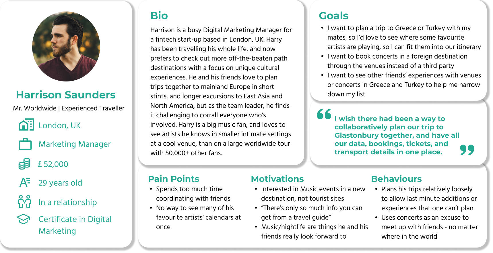
The User Persona is a culmination of all of the secondary and primary research that I’ve conducted thus far. Distilling all of these data points and insights into a human-centred persona is a crucial part of the UX Design process, and allows us to keep our persona’s needs at the forefront of design decision-making.
Let’s meet Harrison, who goes by Harry, and some of his goals, pain points, motivations, and behaviours when it comes to travelling and experiencing live music concerts and events.
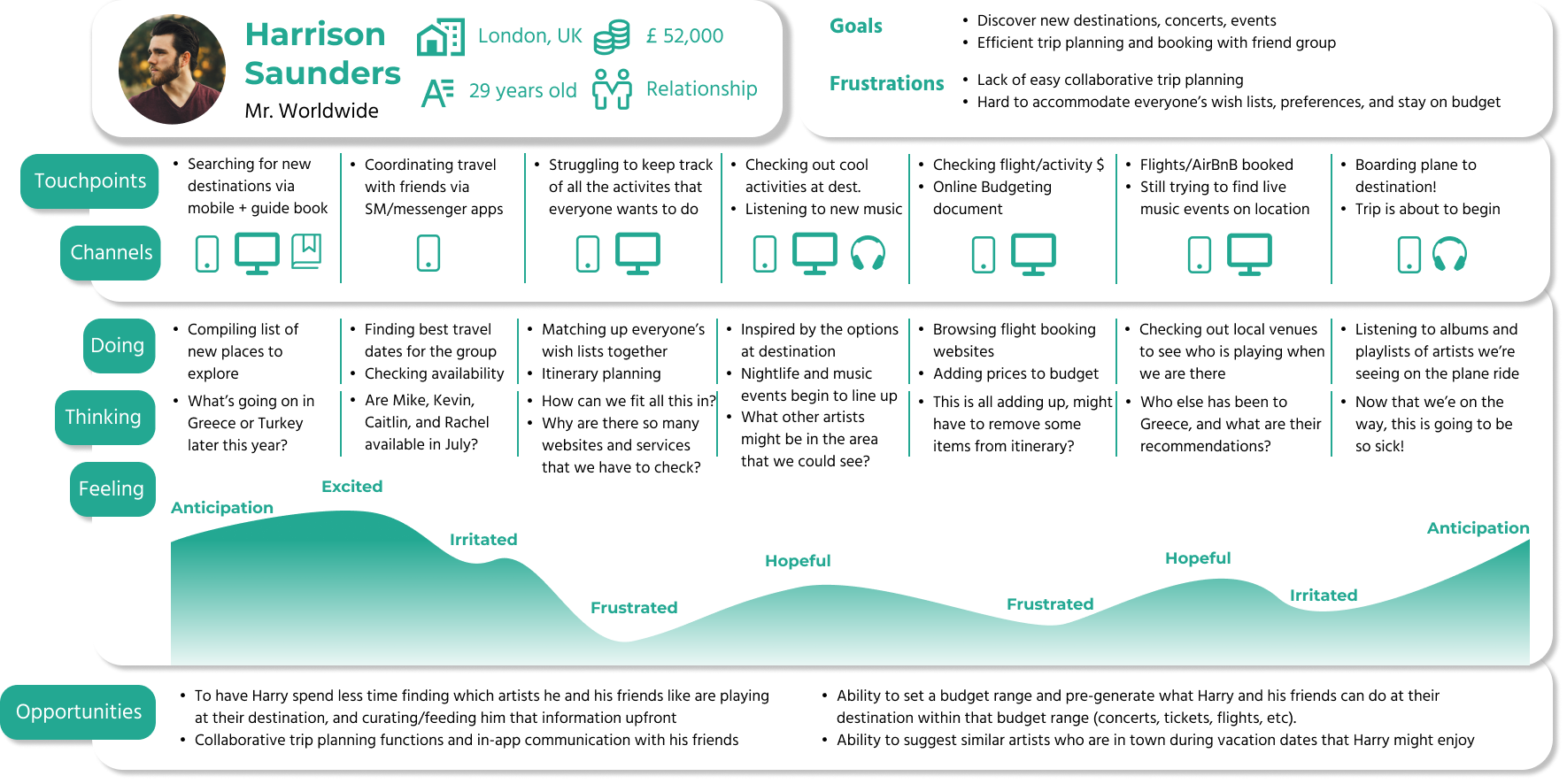
The Experience Map is a useful tool used to demonstrate a user’s overall journey in the problem space, outside of using the digital product solution.
Harry goes through this similar emotional arc when planning trips, especially when others are involved, beginning with the excitement of exploring a new place, through to the headache of coordinating with his friends and finding available flights / accommodation at the right prices, and ending with the anticipation of experiencing a new destination, and making memories with his friends and family.
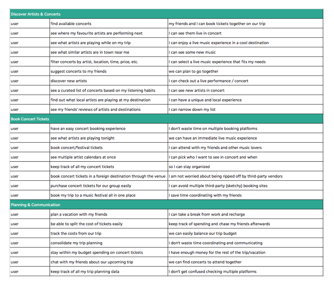
Now we are transitioning from the ‘Synthesis’ phase into the ‘Ideation’ phase of solving this problem. This is the step where we begin to explore User Stories + Epics of how someone like our persona Harry might use a digital solution. We use this tool to explore Harry’s goals and how the digital solution can align with the benefits he’s looking for. Authoring User Stories and identifying Epics is a pivotal moment in the UX process that allows us to gain insight into what solutions we need to design for Harry.
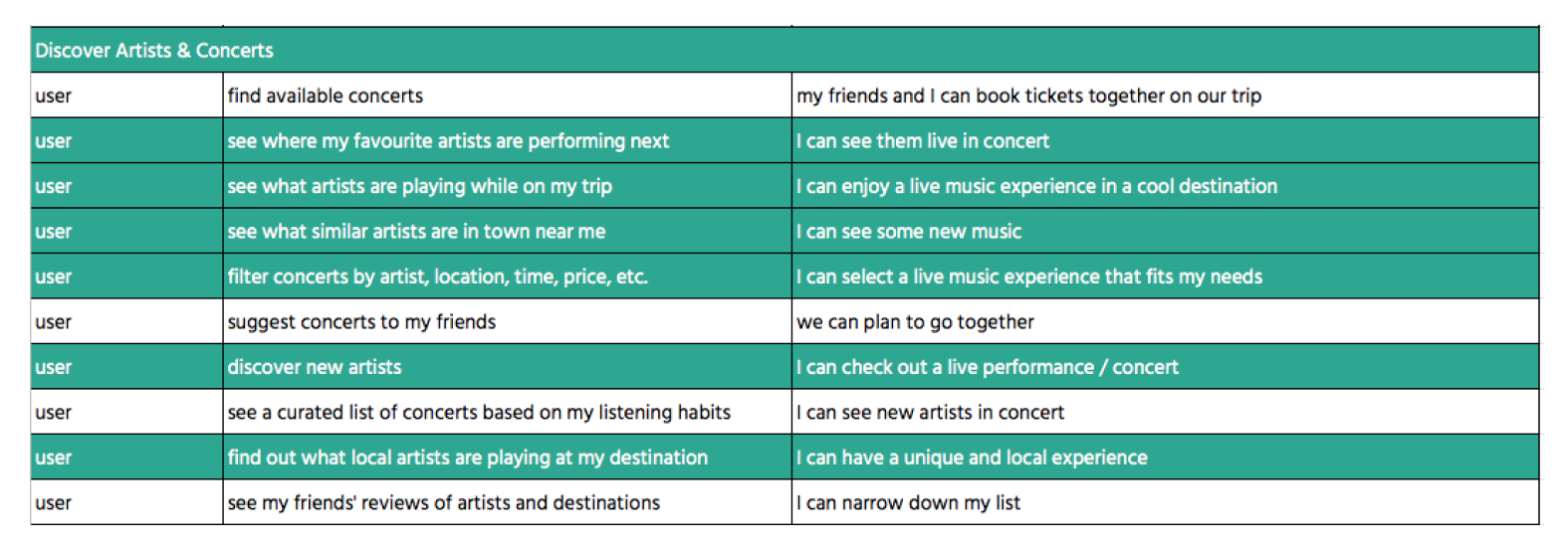
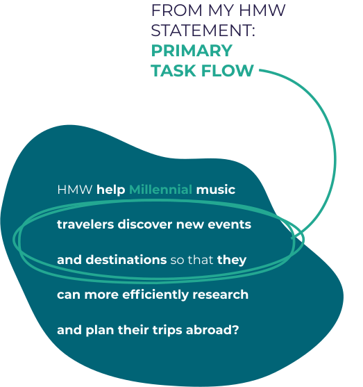
Moving onto the Task Flow Diagrams allows me to demonstrate a series of steps that Harry might take to complete a specific task. For sketching and designing the Primary Task Flow, I chose to focus on the following Epic:
Discover Artists & Concerts
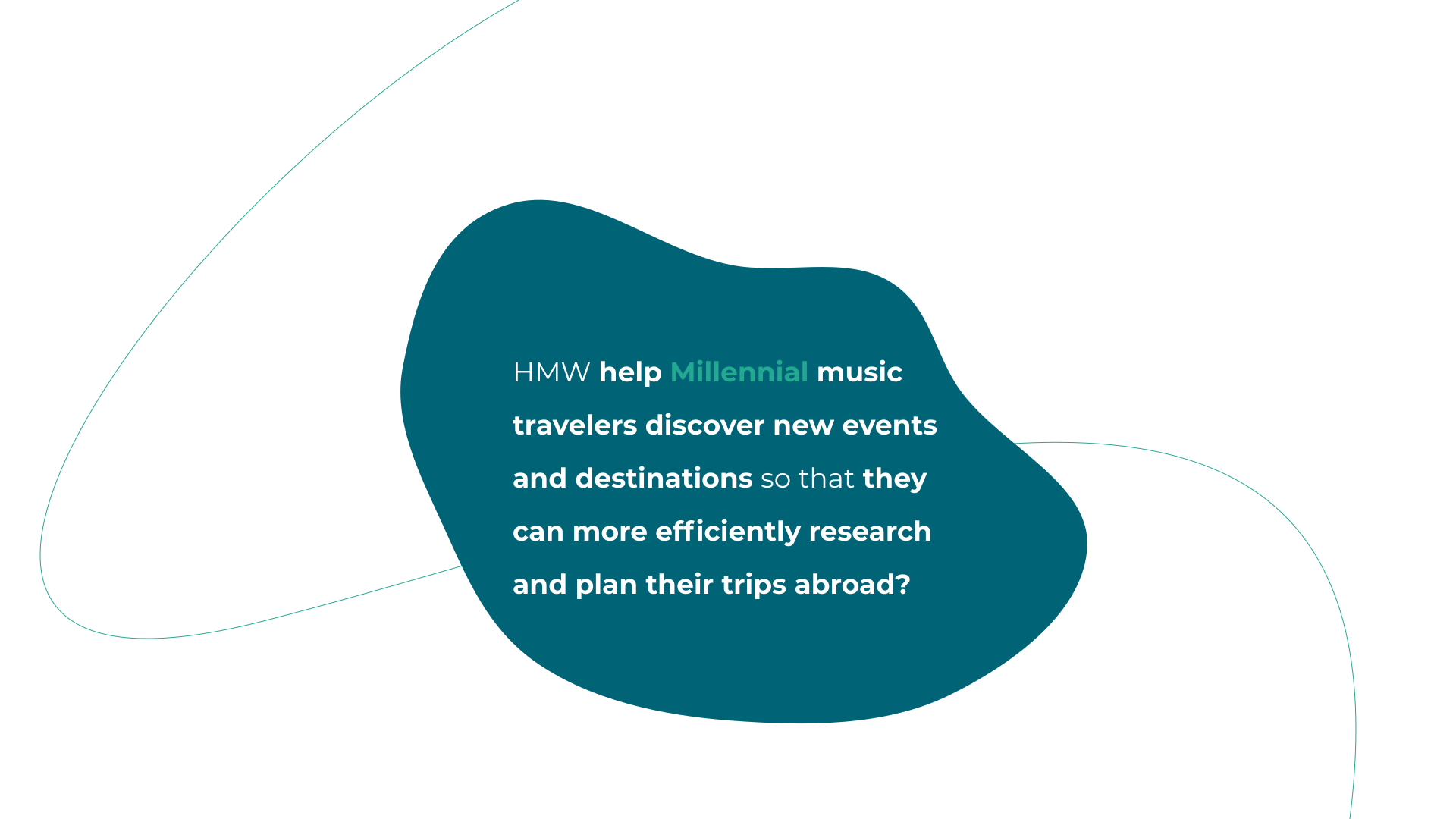
This Epic directly relates back to the crucial part of my HMW statement that is used as a guiding North Star for the project.
04
Create
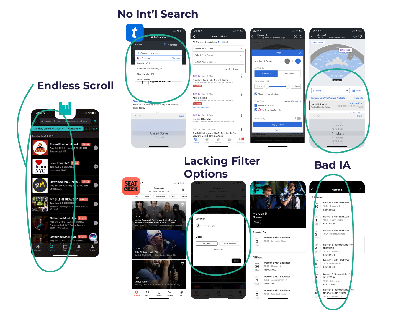
In looking to improve upon existing ticket booking products, I conducted a competitor analysis of some other Music / Concert / Live Music Experience booking apps, and identified some bad UI components that I wanted to improve upon in my digital solution.
To begin the digital solution design process, I began by collecting UI Inspiration images for different functional areas of the app. The UI Inspiration Board is a great repository of functionality inspiration that I created to help guide the design of the initial prototype. The full UI Inspiration Board can be seen here:

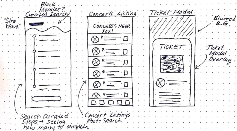
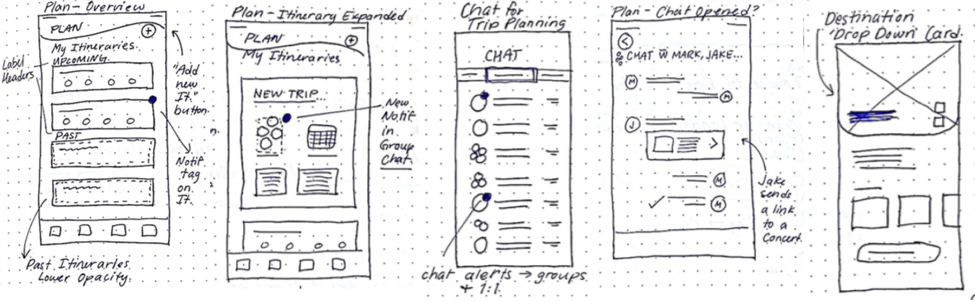
Next I began by iterating some exploratory sketches based off of the UI Inspiration I gathered. Then I went on to specific Solution Sketches illustrating the Primary Task Flow, which can be seen on the subsequent 2 slides. I used these Solution Sketches, along with the UI Inspiration to begin building my Greyscale Wireframes and Interactive Prototype. By ideating some options for my Primary Task Flow through hand-drawn Solution Sketches, I was able to quickly decide which features and UI Elements would work in my Primary Task Flow. For example, I decided that the bottom overlay modal for the search function didn’t quite give me the desired effect of ‘curating results’. I went with something a little more interactive as seen on the subsequent screens.

05
Test
As part of the UX Diploma Capstone project, I conducted usability tests with 10 different users in order to obtain practical real-time feedback that will be incorporated into the design revisions of the interactive greyscale prototype. Here is a brief overview of the testing plan and scenario that I used to evaluate my designs.
Scenario:
You are a… Millennial music traveler looking to find concerts and artists playing at your chosen destination.
Summary:
- Very familiar with native mobile applications for other services
- Have used this app before, and already made an account and signed in
- App will be the primary method for users to find concerts and live music experiences at a foreign destination
Goal:
Discovery: You want to Find Artists & Concerts that are playing at your destination for your upcoming trip with friends.
After completing the Usability Tests, I completed the Sessions Output Document. The feedback and suggestions from the Usability Tests were applied to my final revision of the prototype as can be seen here as well. More suggestions and further build outs of other task flows will be included in the High Fidelity Prototype.
Key Learnings:
- The ways to launch the Curated Search function need the most design refinement, and the Curated Results screen could have clearer Information Architect as it relates to the filters that the user input.
- Visual Design and Aesthetic impressed users, but certain issues in functionality still came through in the testing phases.
Next Steps:
- Further build out the Booking Concerts secondary task flow, and the Sharing Concerts to friends secondary task flow.
- Build out the other sections of the app - Profile, Plan, and Tickets, to achieve a comprehensive Prototype.
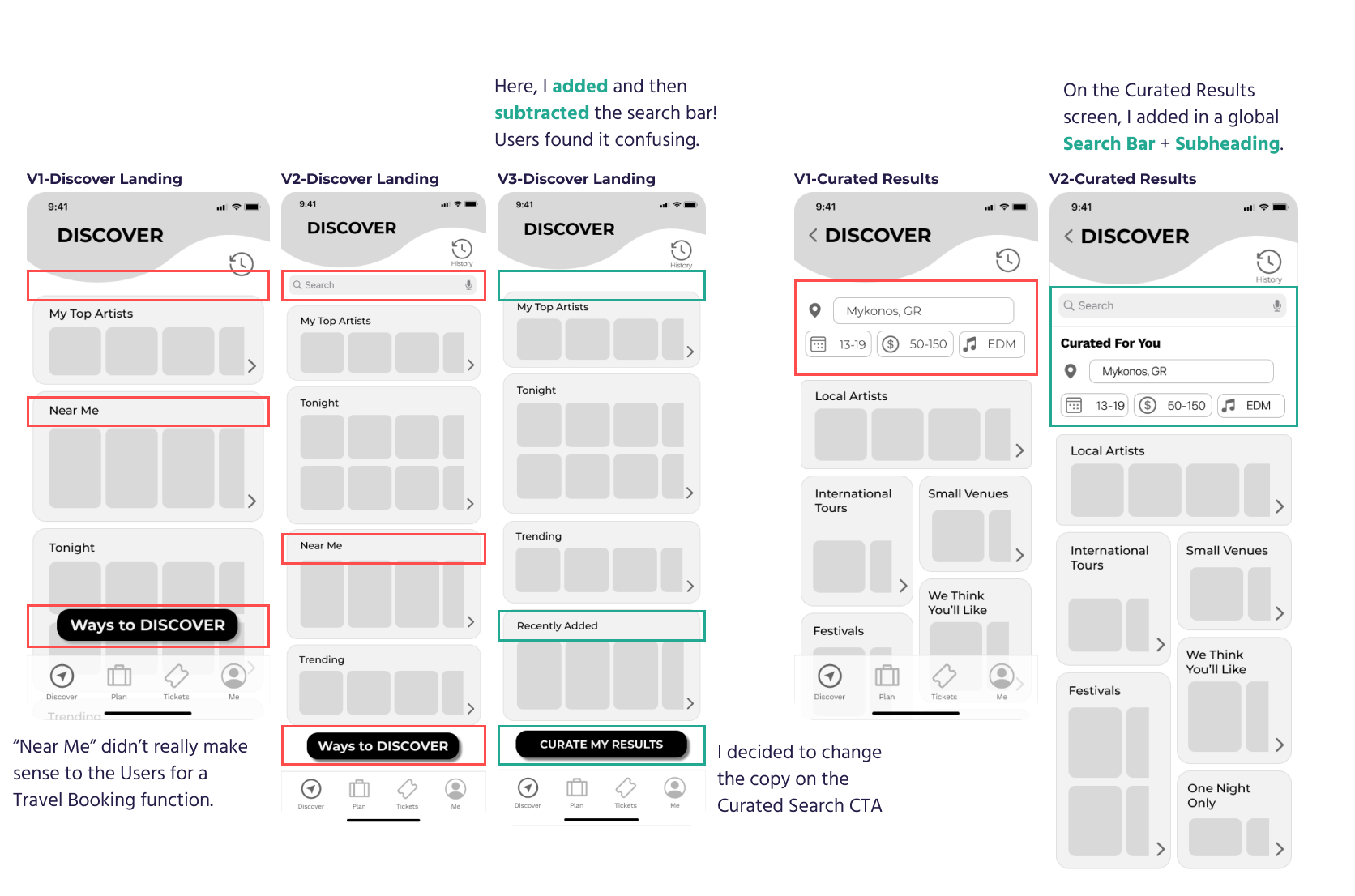
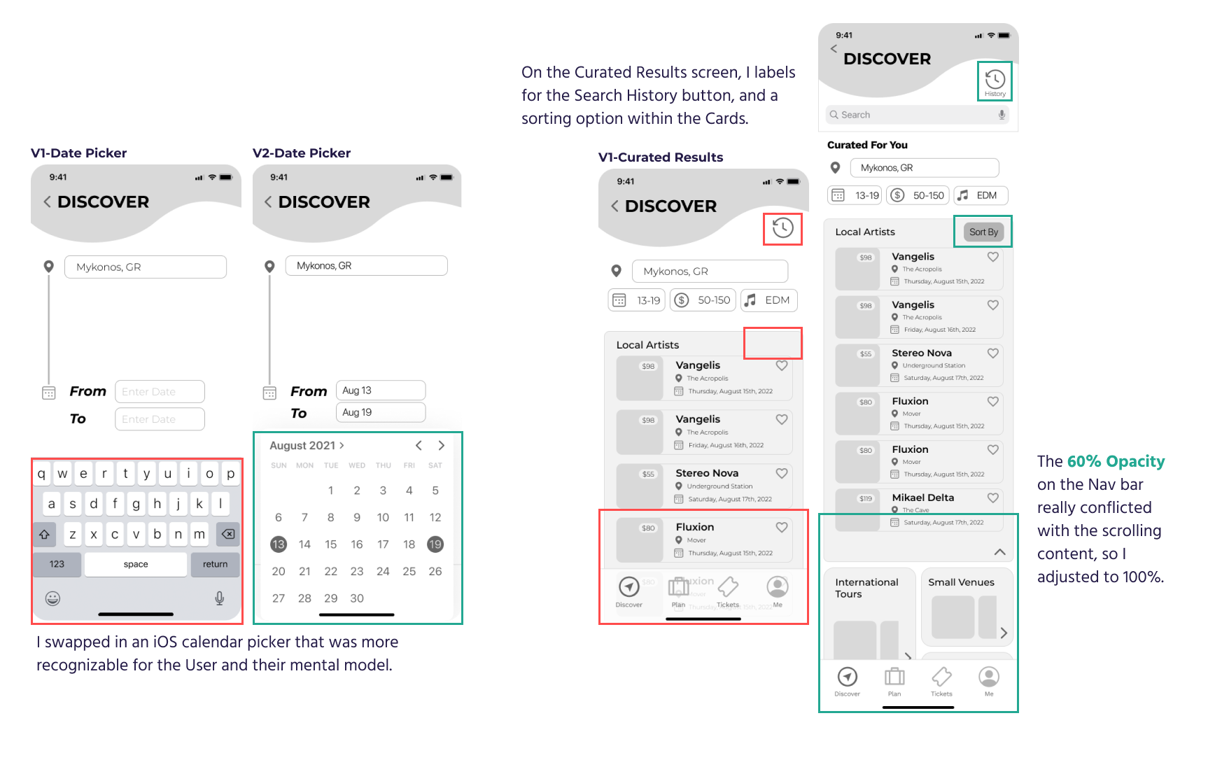
06
Realize
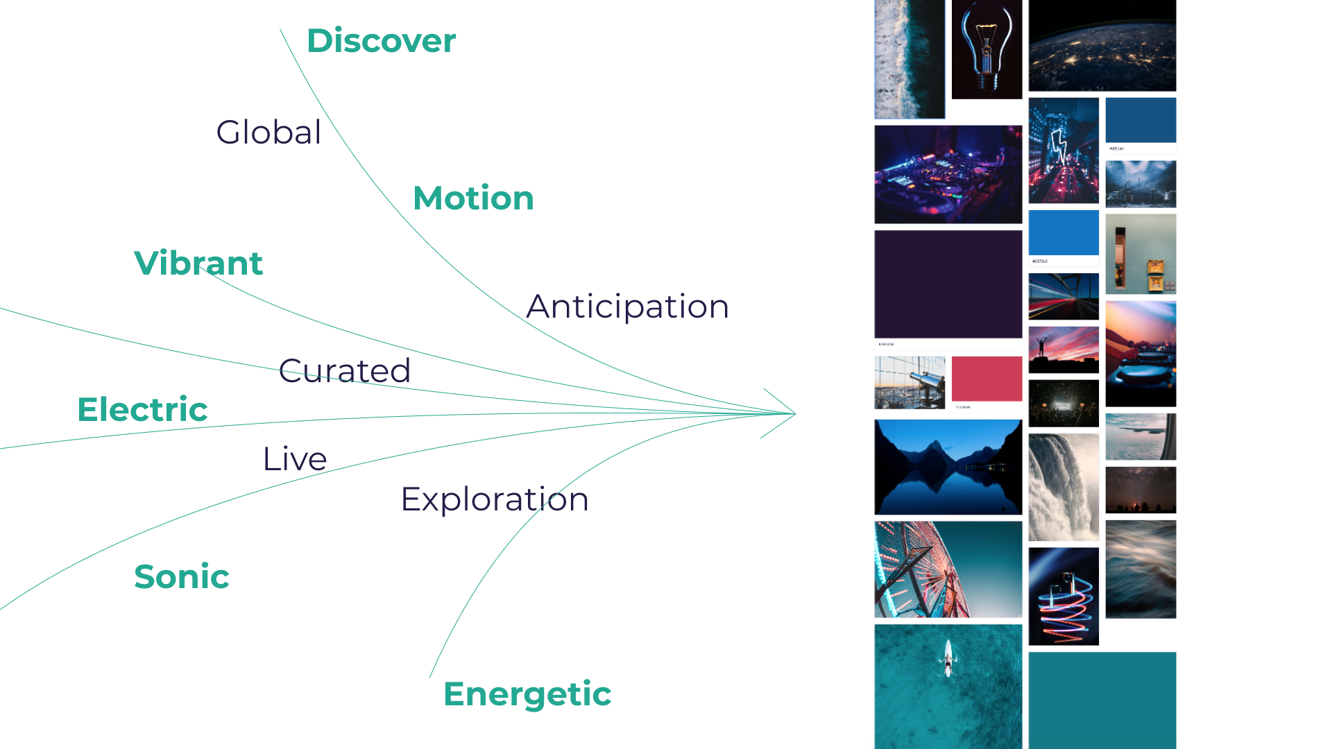
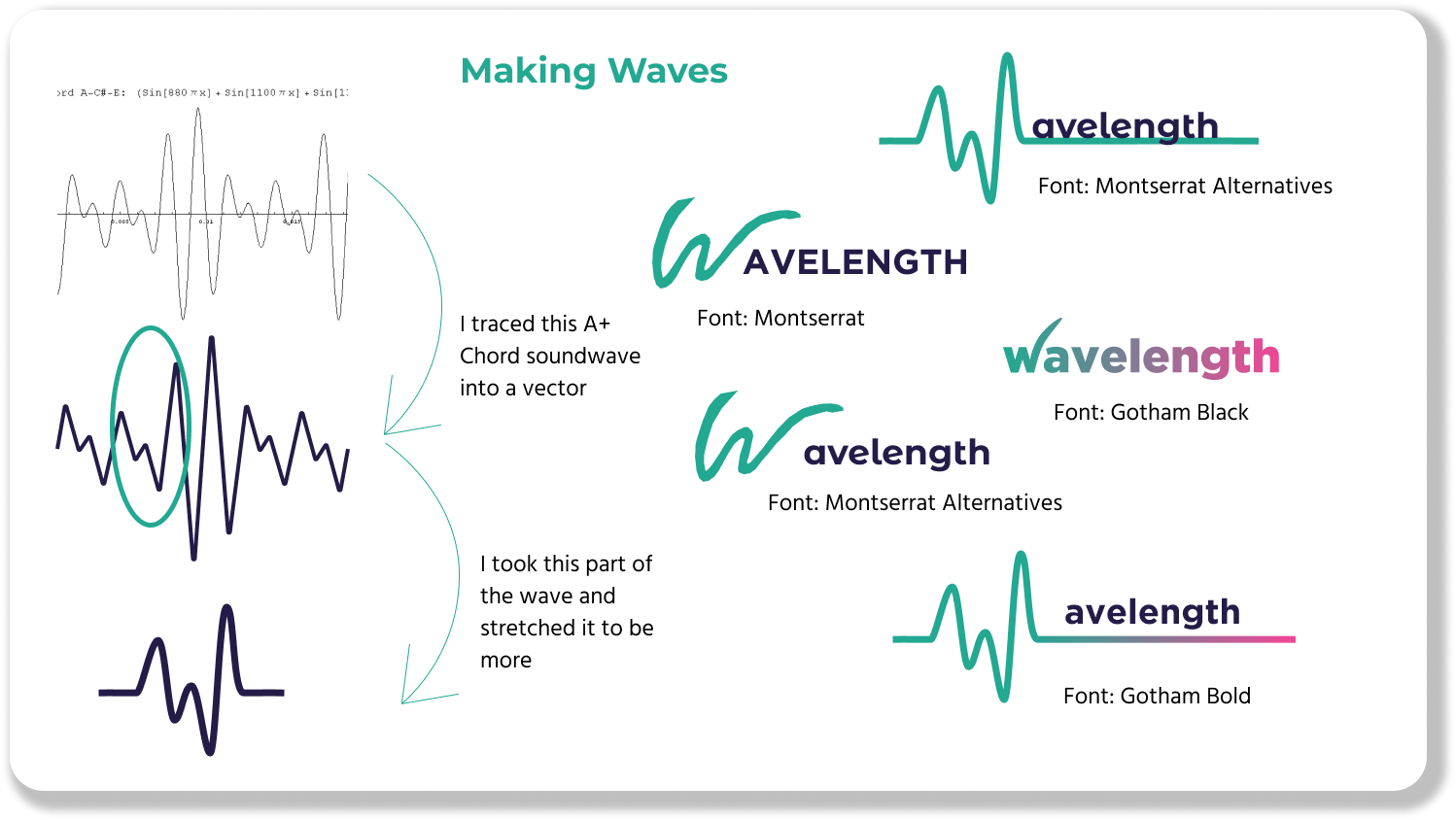
Brand Development has to start somewhere. I started the process by selecting some Keywords that I wanted to display through visuals, colours, and aesthetics. I explored Colours, Emotions, and Visuals to create what would become the colour palette for my app UI, as well as to gain inspiration for other design elements. For example, I incorporated the neon pinks from late-night live music events and stunning travel sunsets into the UI as an accent colour. I also explored Typography, Iconography and Wordmark/App Icon designs to round out the ideation phase here.
The wordmark represents the brand identity in a visual combination of text and iconography. Here are some explorations of app names, stylized wordmarks, and anchor icons/graphics.
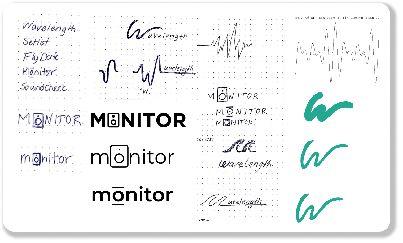
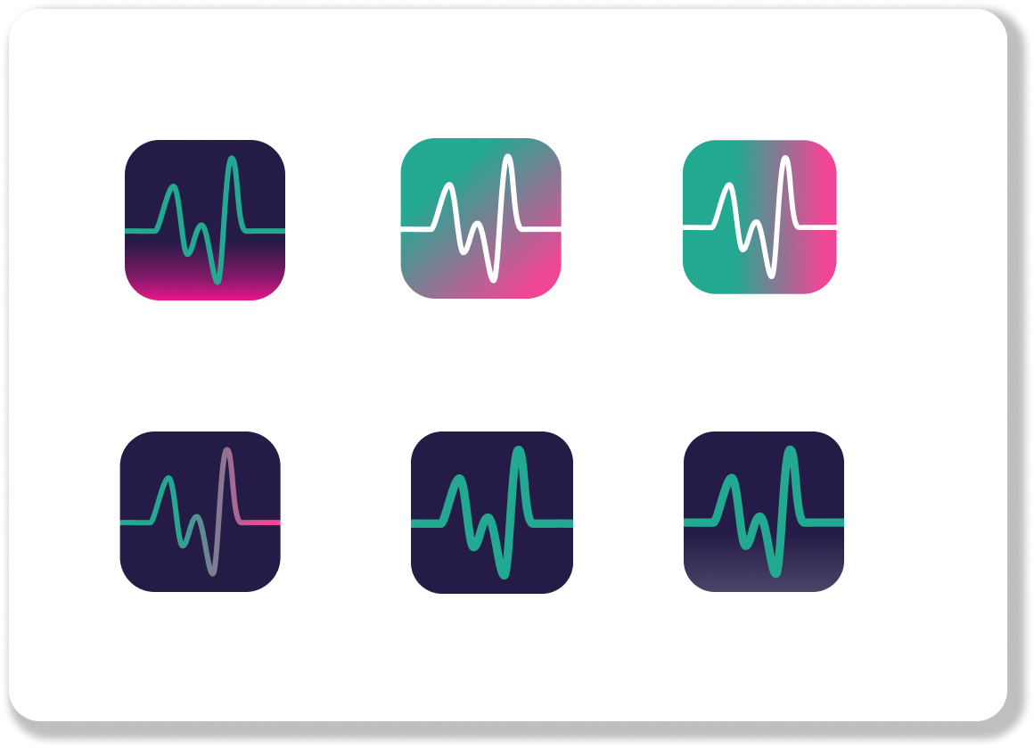
Here are some highlights of the Wavelength App Icon where I tested injecting different branding colour combinations, played with my gradient, and the stroke weight of the “W” logo.
With the Brand Development phase complete, I revisited my UI Inspiration to begin the Mobile App Design in High Fidelity. This allowed me to focus on more specific aspects of the UI that I took inspiration from, and to polish the cohesive look and feel of the app.
In building out my Hi-Fi Prototype, I decided to add on the short Secondary Task Flow of “Sending A Concert to Friends” within the Plan Function of the mobile app. Here are some additional ideation sketches I did, building off of my revised UI Inspiration to design the Plan and Chat functions.
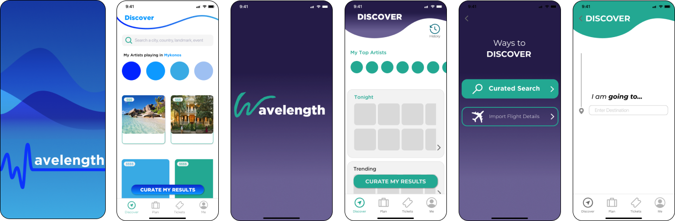
With the moodboard complete, I began to play around with injecting different colour combinations to my greyscale wireframes. Here are a few instances that I first landed on. I decided to move forward with the green and dark purple combo, but I decided not to use the purple gradient as it did not translate well when previewing directly on mobile with Figma Mirror.
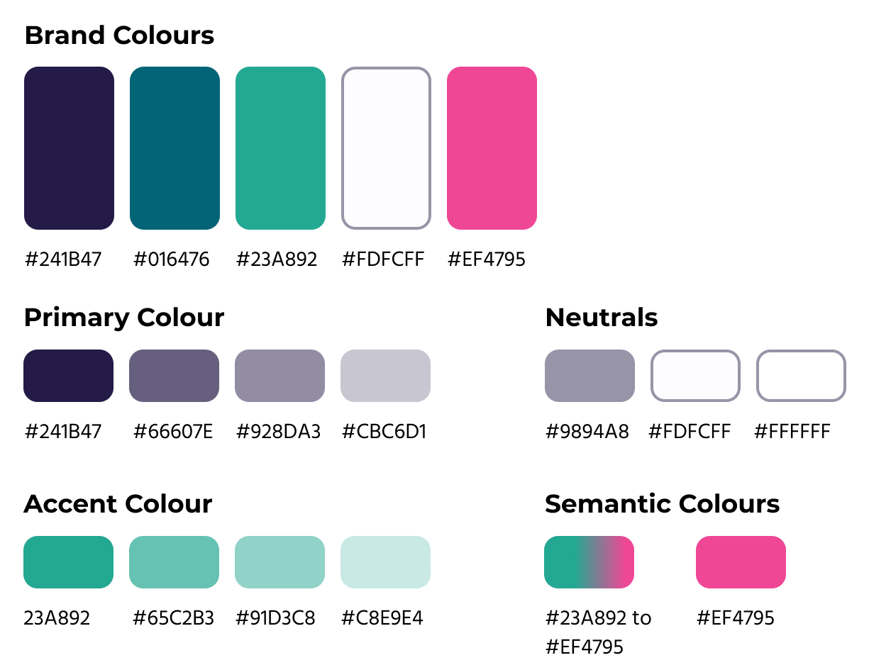
Colour is the foundation of the User Experience with the Wavelength mobile app. It communicates the mood and vibe of the product to the user through a cohesive colour palette. Here, you can see the final Brand Colours I selected expand into primary, accent, neutral, and semantic colours that appear at specific instances throughout the Wavelength app.
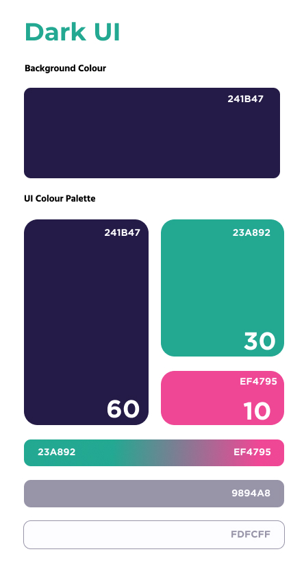
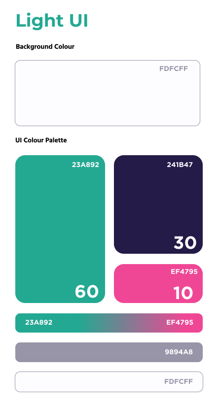
Wavelength’s mobile User Interface has two different colour states: a Light UI (used for Exploratory and Functional screens), and a Dark UI (used for search function takeovers and loading screens). Using the traditional 60-30-10 colour palette guide, the two colour states are inversely related, and complement eachother well. The changing UI colour states visually communicate which portion of the app is displayed on screen to the user.
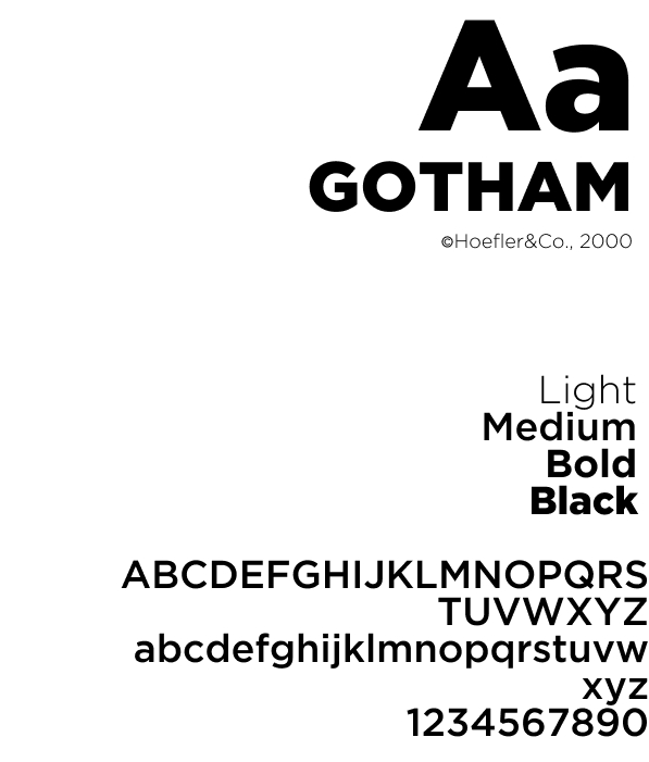
Gotham is a sans-serif typeface with a large family of fonts that was created in the year 2000 by the type foundry Hoefler & Co. commissioned by GQ Magazine.
I selected Gotham for multiple reasons: it has extremely versatile and varied font weights, as well as being very legible for both print and screen use. Gotham is also an extremely familiar and recognizable font for our persona Harry and his millennial age group: Gotham is the face of GQ Magazine, the 2008 Presidential Campaign of Barak Obama, the official font of New York University, and the official font of Taco Bell. While all of these instances are indeed very American in nature, they are universally recognized and appeal to a wide swath of our target audience of Millennial users.
To see more in depth details on the UI design decisions, check out the full Wavelength UI Library here.
Here is the Wavelength app summarized in some screenshots of the Primary and Secondary flows that I designed. Check out the full working prototype here if you missed it above:
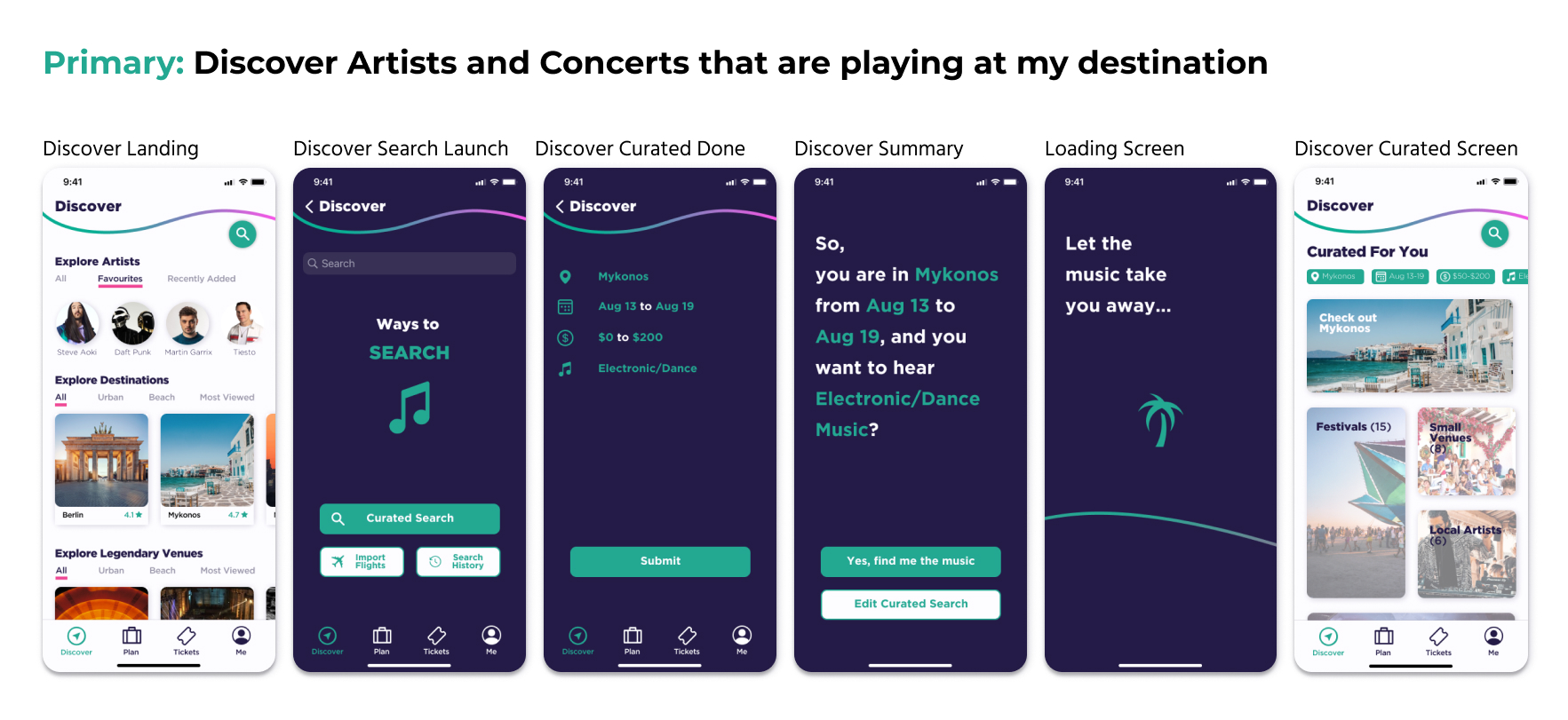
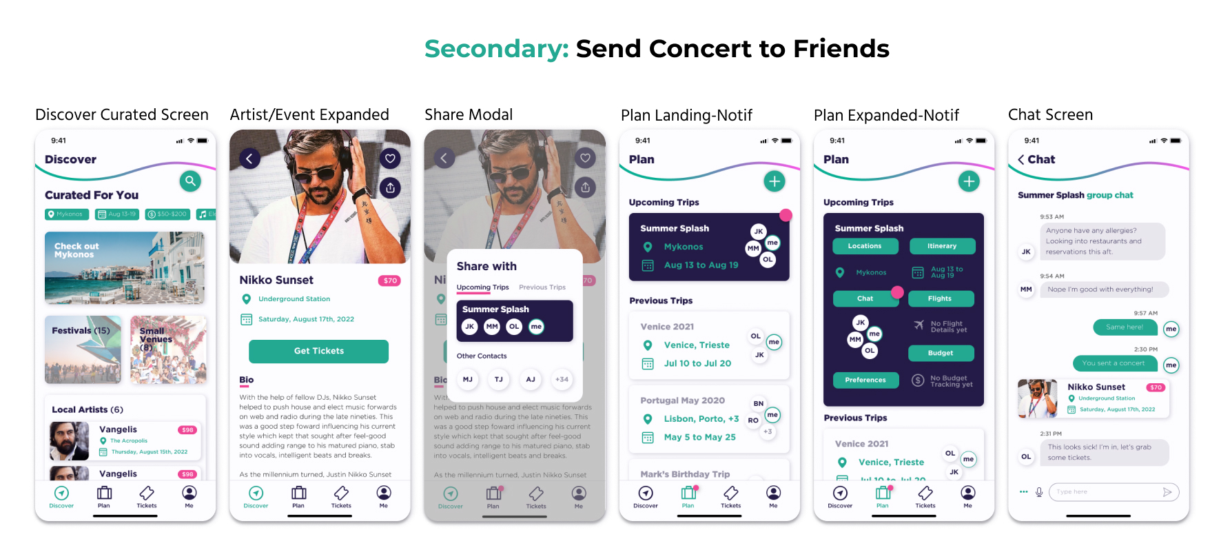
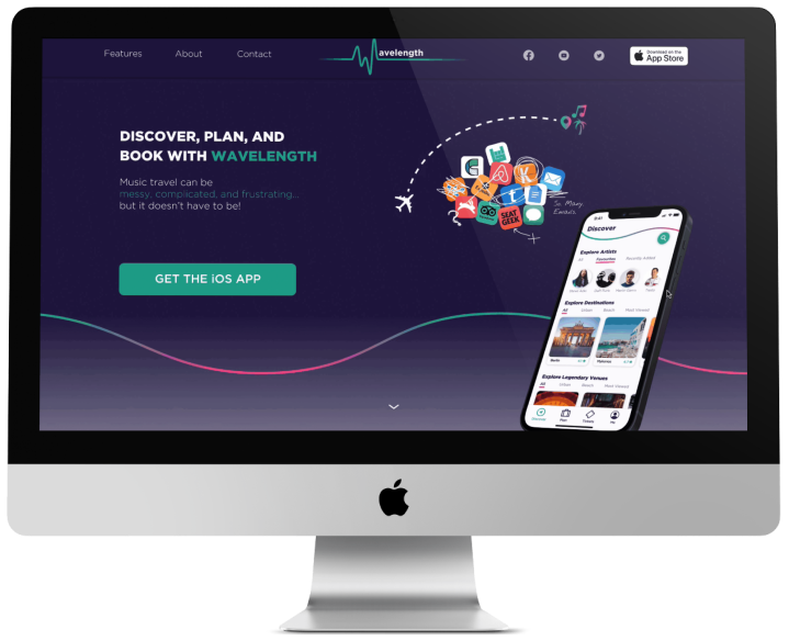
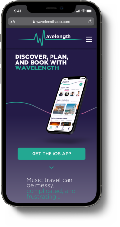
Wavelength is now ready to launch. To do so, I created a Responsive Desktop and Mobile product marketing website where new and potential users like Harry can find out why Wavelength exists, how it can help them, what features it has, and where to easily download. I began by designing for Desktop first. Then I used a Content Flow Diagram as a tool to demonstrate how the website’s content and layout will scale to mobile view, to better help me design the mobile site.
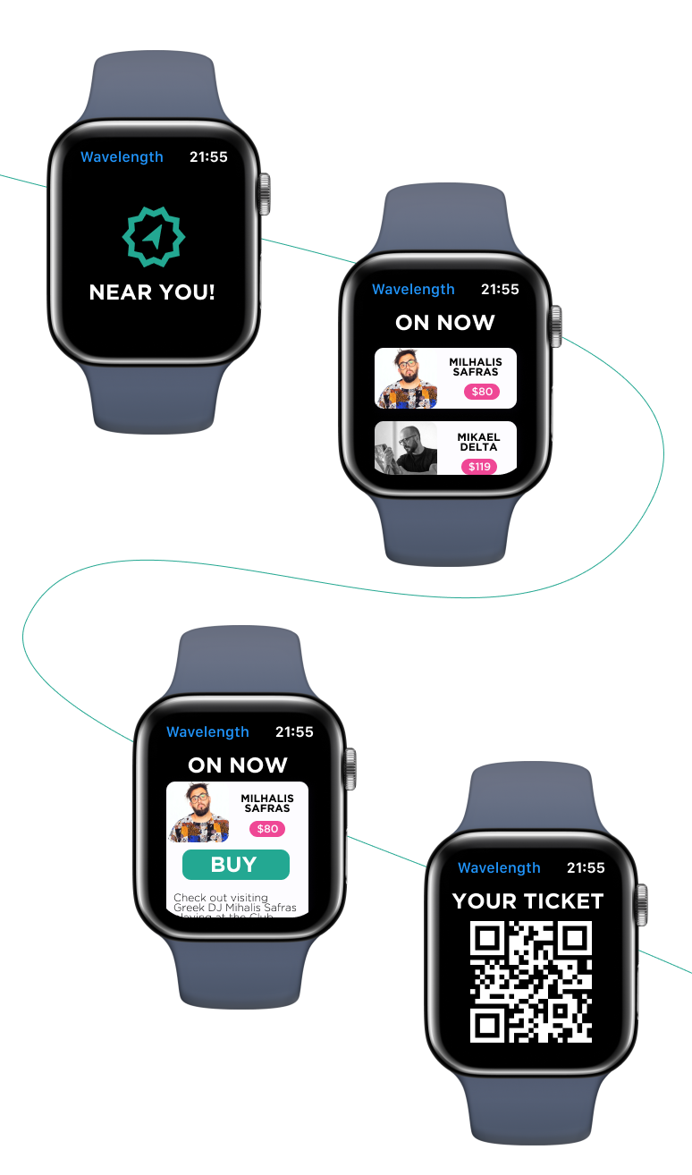
Thinking about Wavelength's scalability and expansion to other platforms is a great concluding exercise to test the future viability of the product I designed. Here is a brief scenario I thought of and mocked up for Apple Watch and other wearable technology, under the Tickets function of the app.
Let's say Harry is out in downtown Barcelona with his friends, having a night on the town. Harry's Wavelength Apple Watch app is tracking his location, and sees there are some live music experiences that match Harry's preferences playing nearby.
The watchOS notifies Harry, shows him which concerts have tickets available, and allow him to buy tickets for him and his friends in less than 4 taps. The tickets are then loaded onto Harry's Apple Watch in scannable QR Code format, and they head off to the concert location!
The most useful thing that came out of the research phase was how much the interviewees' actual behaviour differed from what the secondary data suggested. People described much more spontaneous, loosely-planned trip planning than the market data implied, which pushed the design away from structured itinerary management and toward discovery and coordination tools. Following that finding rather than the initial framing changed the product in a significant way.
Because this project didn't have a client brief constraining the visual direction, I had full control over the aesthetic, which meant every decision needed to be justified on its own terms. The typeface choice, the dark and light UI states, and the colour palette all had to hold up across a full product rather than just a hero screen, and working through that end-to-end is where I developed a real understanding of what a design system needs to do.
Eight weeks from research to a high-fidelity prototype with a marketing site and a wearable concept is a tight window, and it forced me to be deliberate about which parts of the design needed to be fully resolved versus which could remain open without the overall thing falling apart. That is a habit I have carried into every project since.
Check out my design work here.
←
→